Revision Notes on Data Handling
Introduction to Data Handling
Data handling means to collect and present the data so that it could be used in further studies and to find some results.
Data
Any information collected in the form of numbers, words, measurements, symbols, or in any other form is called data.
Graphical Representation of Data
The grouped data can be represented graphically for its clear picture and it is the easiest way to understand the data.
Types of Graph
1. Pictograph
When we represent the data through pictures or symbols then it is called Pictograph.

Here one tree represents 10 trees. And we can easily read the pictograph.
The graph shows that there are 30 trees of apple and so on.
2. Bar Graphs
In the bar graph, the information represented by the bars of the same width with equal gaps but the height of the bars represent the respective values.

Here, the names of pets are represented on the horizontal line and the values of the respective pets are shown by the height of the bars. There is an equal gap between each bar.
3. Double Bar Graph
To compare some data we can use the double bar graph as it shows the information of two quantities simultaneously.

Here, in the above graph, it represents the marks of the students in two different tests altogether. So we can compare the marks easily.
Organizing Data
Any data which is available in the unorganized form is called Raw Data.
This raw data is arranged or grouped in a systematic manner to make it meaningful which is called the Presentation of Data.
Terms Related to Data Organizing
1. Frequency
Frequency tells us the no. of times a particular quantity repeats itself.
2. Frequency Distribution Table
Frequency can be represented by the frequency distribution table.

The above table shows the no. of times a particular colour repeat in the bag of skittles.
Frequency can also be shown by the tally marks. A cut over four lines represents the number 5.
1. Grouping Data
If we have a large number of quantities then we need to group the observation and then make the table. Such a table is called a Grouped Frequency Distribution Table.
Some Important terms related to grouped Frequency Distribution Table
-
Class Interval or Class: When all the observations are classified in several groups according to their size then these groups are called Class Interval
-
Lower-class Limit: The lowest number in every class interval is known as its Lower-class Limit.
-
Upper-class Limit: The highest number in every class interval is known as its Upper-class Limit.
-
Width or Size or Magnitude of the Class Interval: The difference between the upper-class limit and the lower class limit is called the Size of the Class Interval.
Example
There is a list of marks of 40 students in a school. Arrange this in grouped frequency distribution table.

Solution
As we can see that the lowest number in the above data is 27 and the highest number is 78, so we can make intervals if 20 - 30, 30 - 40 so on.

Remark: As number 30 comes in two class interval but we cannot count it in both the intervals. So it is to remember that the common observation will always be counted in the higher class. Hence 30 will come in 30-40, not in 20-30.
Histogram
Basically, the bar graph of the grouped frequency distribution or continuous class interval is called Histogram.
The class intervals are shown on the horizontal line and the frequency of the class interval is shown as the height of the bars.
There is no gap between each bar.
Example
Draw a histogram for the wages of 30 workers in a company. The wages are as follows: 830, 840, 868, 890, 806, 840, 835, 890,840, 885, 835, 835, 836, 878, 810, 835, 836, 869, 845, 855, 845, 804, 808, 860, 832, 833, 812, 898, 890, 820.
Solution
Make the grouped frequency distribution of the given data.
| Class Interval | Frequency |
| 800 – 810 | 3 |
| 810 – 820 | 2 |
| 820 – 830 | 1 |
| 830 – 840 | 9 |
| 840 – 850 | 5 |
| 850 – 860 | 1 |
| 860 – 870 | 3 |
| 870 – 880 | 1 |
| 880 – 890 | 1 |
| 890 – 900 | 4 |
Draw the histogram by taking the class interval on the horizontal line and the frequency on the vertical line.

Remark: As the class interval does not start from zero, so we will put a jagged line which shows that there is no number between 0 – 800.
Circle Graph or Pie Chart
If we represent the data in a circle form then it is said to be a pie chart. This graph shows the relationship between the whole and its part. We have to divide the circle into sectors and each sector is proportional to its respective activity.
We use it when we have information on percentage or fraction.
Drawing of a Pie Chart
If we have the information in percentage then we need to calculate the respective angles to show them in the pie chart.
As we know that a complete circle is of 360°, so we need to calculate the fraction of 360° for every sector.
Example
Draw a pie chart of the following percentage of genres of movies liked by the public.
| Genres of Movie | Percentage of the no. of people |
| Comedy | 27% |
| Action | 18% |
| Romance | 14% |
| Drama | 14% |
| Horror | 11% |
| Foreign | 8% |
| Science fiction | 8% |
Solution
To draw the pie chart first we need to calculate the angle by taking the fraction of 360°.
| Genres of Movie | Percentage of the no. of people | In fractions | Fraction of 360° |
| Comedy | 27% | 27/100 | 27/100 × 360° = 97.2° |
| Action | 18% | 18/100 | 18/100 × 360° = 64.8° |
| Romance | 14% | 14/100 | 14/100 × 360° = 50.4° |
| Drama | 14% | 14/100 | 14/100 × 360° = 50.4° |
| Horror | 11% | 11/100 | 11/100 × 360° = 39.6° |
| Foreign | 8% | 8/100 | 8/100 × 360° = 28.8° |
| Science fiction | 8% | 8/100 | 8/100 × 360° = 28.8° |
By using these angles draw a pie chart.

Chance and Probability
Probability tells the degree of uncertainty. It measures the likelihood that an event will occur.
Random Experiment
If the result of the experiment is not known then it is known as a random experiment.
Example
If we throw a dice then the result could be any number from 1 – 6.

Outcomes
When we do an experiment then there could be different results, these possible results of the random experiment are called outcomes.
Example
There are two possible outcomes when we toss a coin i.e. head and tail.
Equally Likely Outcomes
If every outcome has the same possibility of occurring these outcomes are called Equally Likely Outcomes.
Example
If we throw a dice then there is an equal chance of every no. to come while doing the random experiment. i.e. a dice has the same possibility of getting 1, 2, 3, 4, 5 and 6.
Linking Chances to the Probability

Example
What is the chance of getting 3 when we throw a dice?
Solution
There is only one chance to get 3 in one throw and the total possible outcomes are 6.
Hence the probability of getting =1/6.
Outcomes as Events
Each outcome or collection of outcomes of an experiment is known as an event.

Example
If we throw a dice then getting each outcome 1, 2, 3, 4, 5 and 6 are events.
Example
What is the event of getting odd numbers when we throw a dice?
Solution
The probability of getting an odd number is 3(odd numbers are 1, 3, 5)
The total number of outcomes is 6.
The probability of getting an odd number = 3/6.
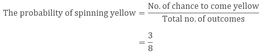
Example
What is the probability of spinning yellow?

Here number of chance to come yellow while spinning is 3.
The total number of outcomes is 8.
View courses by askIITians


Design classes One-on-One in your own way with Top IITians/Medical Professionals
Click Here Know More

Complete Self Study Package designed by Industry Leading Experts
Click Here Know More

Live 1-1 coding classes to unleash the Creator in your Child
Click Here Know More