Chapter 23 Data Handling III (Bar Graphs) Exercise 23.2
Question: 1
Explain the reading and interpretation of bar graphs.
Solution:
A bar graph is a graph with its length proportional to the value it represents. The bars in a bar graph can be plotted vertically or horizontally. A bar graph is a visual display used to compare the amount or frequency of occurrence of different characteristics of data.
Bar graph allows us to
-
Compare groups of data
-
Make generalizations about the data quickly
Question: 2
Read the following bar graph and answer the following questions:

(i) What information is given by the bar graph?
(ii) in which year the export is minimum?
(iii) In which year the import is maximum?
(iv) In which year the difference of the values of export and import is maximum?
Solution:
Let’s draw a chart using the information from the above bar graph:
| Years | Export (in 100 crores of Rs) | Imports (in 100 crores of Rs) | Difference of import and export (in 100 crores of Rs) |
| 1982 – 83 | 8 | 14 | 6 |
| 1983 – 84 | 10 | 18 | 8 |
| 1984 – 85 | 12 | 19 | 7 |
| 1985 – 86 | 11 | 20 | 9 |
| 1986 – 87 | 12 | 22 | 10 |
(i) It provides us the information on the total amount of imports and exports in different years between 1982 and 1987.
(ii) In the year 1982 — 83, the export is at its lowest.
Explanation: In the year 1982 — 83, exports amounted to 800 crores rupees, i.e., the lowest from all other years.
(iii) In the year 1986 — 87, the import is at its maximum.
Explanation: In the year 1986 — 87, imports amounted to 22,000 crores rupees, i.e., the highest from all other years.
(iv) In the year 1986 — 87, the difference in the amount of exports and imports is the maximum.
Explanation: In the year 1986 — 87, the difference in the values of export and import is 1000 crores rupees.
Question: 3
The following bar graph shows the results of an annual examination in a secondary school. Read the bar graph (Fig. 23.22) and choose the correct alternative in each of the following:
(i) The pair of classes in which the results of boys and girls are inversely proportional are:
(a) VI, VIII (b) VI, IX (c) VIII, IX (d) VIII, X
(ii) The class having the lowest failure rate of girls is
(a) VII (b) X (c) IX (d) VIII

(iii) The class having the lowest pass rate of students is:
(a) VI (b) VII (c) VIII (d) IX
Solution:
Let’s draw a chart using the information from the above bar graph.
| Class | Percentage of boys | Percentage of girls |
| VI | 80 | 70 |
| VII | 40 | 100 |
| VIII | 90 | 50 |
| IX | 70 | 80 |
| X | 70 | 90 |
(i) (b) VI, IX
Explanation: In Class VI, the percentage of boys = 80
In Class IX, the percentage of girls = 80
In Class VI, the percentage of girls = 70
In class IX, the percentage of boys = 70
(ii) (a) VII
Explanation: In class VII, the passing percentage of girls is at its peak i.e. 100%.
In this class, 0% of girls failed.
(iii) (b) VII and (c) VIII
Explanation: In class VII and VIII, the sum of vertical heights of the percentage of boys and girls in the given bar graph is same and that is 140 units. And this sum of heights is the least compared to all other
classes.
Question: 4
The following bar graph shows the number of persons killed in industrial accidents in a country for some years (Fig 23.23)

Read the bar graph and choose the correct alternative in each of the following: (i) The year which shows the maximum percentage increase in the number of persons killed in coal mines over the preceding year is:
(a) 1996 (b) 1997 (c) 1999 (d) 2000
(ii) The year which shows the maximum decrease in the number of persons killed in industrial accidents over the preceding year is:
(a) 1996 (b) 1997 (c) 1998 (d) 1999
(iii) The year in which the maximum number of persons was killed in industrial accidents other than those killed in coal mines are:
(a) 1995 (b) 1997 (c) 1998 (d) 1999
Solution:
Let’s draw a chart using the information from the above bar graph.
| Year | Persons killed in industries accidents | Persons killed in coal mines |
| 1995 | 1600 | 300 |
| 1996 | 900 | 200 |
| 1997 | 1200 | 300 |
| 1998 | 1300 | 100 |
| 1999 | 900 | 100 |
| 2000 | 1300 | 200 |
(i) (d) 2000
Explanation: In 1997, the death increased to 300 from 200, and in 2000, the death increased to 200 from 100.
Therefore, percentage increase in the amount of death in coal mines in the year 1997 ⟹ from 200 to 300 ⟹ 50% increase
Therefore, percentage increase in the amount of death in coal mines in the year 2000 ⟹ from 100 to 200 ⟹ 100% increase
(ii) (a) 1996
Explanation: Both the years, 1996 and in 1999, show a decrease in the amount of persons killed by industrial accidents.
Therefore, percentage decrease in the amount of death due to industrial accidents in the year 1996 => from 1600 to 900 = 43.75%
Therefore, percentage decrease in the amount of death due to industrial accidents in the year 1999 => from 1300 to 1900 = 30.77%
(iii) (a) 1995
Explanation: In the year 1995, 1600 persons were killed by industrial accidents, which is the highest compared to the other years.
Question: 5
The production of saleable steel in some of the steel plants of our country during 1999 is given below:
| Plant | Bhilai | Durgapur | Rourkela | Bokaro |
| Production | 160 | 80 | 200 | 150 |
Construct a bar graph to represent the above data on a graph paper by using the scale 1 big divisions = 20 thousand tonnes.
Solution:
Let’s draw two mutually perpendicular lines OX and OY.
Along the horizontal line OX, let’s mark plants; and along the vertical line OY, let’s mark the production.
Along the axis OX, let’s measure an equal width for each bar, the gap between the bars being the same.
We will now choose a suitable scale to determine the heights of the bar.
Here, let’s choose 1 big division = 20 thousand tons
Therefore, the heights of the bars as follows:
Height of the bar against Bhilai = 160/20 = 8 units.
Height of the bar against Durgapur = 80/20 = 4 units.
Height of the bar against Rourkela = 200/20 = 10 units.
Height of the bar against Bokaro = 150/20 = 7.5 units.
Now, based on the above calculation the graph is as follows:

Question: 6
The following data gives the number (in thousands) of applicants registered with a divisions = 20 thousand tonnes.
| Year | 1995 | 1996 | 1997 | 1998 | 1999 | 2000 |
| Number of applicants registered | 18 | 20 | 24 | 28 | 30 | 34 |
Construct a bar graph to represent the above data.
Solution:
Let’s draw two mutually perpendicular lines OX and OY.
Along the horizontal line OX, let’s mark years; and along the vertical line OY, let’s mark the number of applicants registered.
Along the axis OX, let’s choose a suitable width for each bar, the gap between the bars is the same.
We will now choose a suitable scale to determine the heights of the bars.
Here, let’s choose 1 big division = 4 thousand, applicants
Therefore, the heights of the bars are as follow:
Height of the bar against the year 1995 = 18/4 = 4.5 units.
Height of the bar against the year 1996 = 20/4 = 5 units.
Height of the bar against the year 1997 = 24/4 = 6 units.
Height of the bar against the year 1998 = 28/4 = 7 units.
Height of the bar against the year 1999 = 30/4 = 7.5 units.
Height of the bar against the year 2000 = 34/4 = 8.5 units.
Based on the above calculation, the bar graph is as follows:

Question: 7
The following table gives the route length (in thousand kilometers) of the Indian Railways in some of the years:
| Year | 1960 – 61 | 1970 – 71 | 1980 – 81 | 1990 – 91 | 2000 – 01 |
| Route length | 56 | 60 | 61 | 74 | 98 |
Represent the above data with the help of a bar graph.
Solution:
Let’s draw two mutually perpendicular lines OX and OY.
Along the horizontal line OX, let’s mark years; and along the vertical line OY, let’s mark the route length.
Along the axis OX, let’s choose a suitable width for each bar, the gap between the bars is the same.
We will now choose a suitable scale to determine the heights of the bars.
Here, let’s take 1 big division = 10 thousand kilometres
Therefore, heights of the various bar are as follows:
Height of the bar against 1960 – 61 = 56/10 = 5.6 units.
Height of the bar against 1970 –71 = 60/10 = 6.0 units.
Height of the bar against 1980 – 81 = 61/10 = 6.1 units.
Height of the bar against 1990 – 91 = 74/10 = 7.4 units.
Height of the bar against 2000 – 2001 = 9810 = 9.8 units.
Based on the above calculation, the bar graph is as follows:

Question: 8
he following data gives the amount of loans (in crores of rupees) disbursed by a bank during some years:
| Year | 1992 | 1993 | 1994 | 1995 | 1996 |
| Loan | 28 | 33 | 55 | 55 | 80 |
(i) Represent the above data with the help of a bar graph.
(ii) With the help of the bar graph, indicate the year in which amount of loan is not increased over that of the preceding year.
Solution:
Let’s draw two mutually perpendicular lines OX and OY.
Along the horizontal line OX, let’s mark years; and along the vertical line OY, let’s mark loans in crores.
Along the axis OX, let’s choose a suitable width for each bar, keeping the gap between the bars the same.
We will now choose a suitable scale to determine the heights of the bars.
Here, let’s consider 1 big division = 10 crores of loan
Therefore, the heights of the various bars are as follows:
Height of the bar against the year 1992 = 28/10 = 2.8 units.
Heights of the bar against the year 1993 = 33/10 = 3.3 units.
Heights of the bar against the year 1994 = 55/10 = 5.5 units.
Heights of the bar against the year 1995 = 55/10 = 5.5 units.
Heights of the bar against the year 1996 = 80/10 = 8.0 units.
Based on the above calculation, the bar graph is as follows:

(ii) The year in which the loan amount has not increased than its previous year is 1995.
Explanation: In the year 1994, 55 crore rupees of loan was disbursed by the bank.
Also, in the year 1995, 55 crore rupees of loan was disbursed by the bank.
Question: 9
The following table shows the interest paid by a company (in lakhs):
| Year | 1995 – 96 | 1996 – 97 | 1997 – 98 | 1998 – 99 | 1999 – 2000 |
| Interest | 20 | 25 | 15 | 18 | 30 |
Draw the bar graph to represent the above information.
Solution:
Let’s draw two mutually perpendicular lines OX and OY.
Along the horizontal line OX, let’s mark years; and along the vertical line OY, let’s mark the amount of interest paid by the company.
Along the axis OX, let’s choose a suitable width for each bar, keeping the gap between the bars the same.
We will now choose a suitable scale to determine the heights of the bars.
Here, let’s consider 1 big division = 5 lakhs of rupees paid as interest by the company
Therefore, the heights of the various bars are as follows:
Height of the bar against the year 1995 — 96 = 20/5 = 4 units.
Height of the bar against the year 1996 — 97 = 25/5 = 5 units.
Height of the bar against the year 1997 — 98 = 15/5 = 3 units.
Height of the bar against the year 1998 — 99 = 18/5 = 3.6 units.
Height of the bar against the year 1999 — 2000 = 30/5 = 6 units.
Based on the above calculation, the bar graph is as follows:

Question: 10
The following data shows the average age of men in various countries in a certain year.
| Country | India | Nepal | China | Pakistan | U.K | U.S.A |
| Average age | 55 | 52 | 60 | 50 | 70 | 75 |
Represent the above information by a bar graph.
Solution:
Let’s draw two mutually perpendicular lines OX and OY.
Along the horizontal line OX, let’s mark the countries; and along the vertical line OY, let’s mark the average age for men.
Along the axis OX, we will choose a suitable width for each bar, keeping the gap between the bars the same.
We will now choose a suitable scale to determine the heights of the bars.
Here, let’s consider 1 big division = 10 years
Therefore, the heights of the various bars are as follows:
Height of the bar against India = 55/10 = 5.5 units.
Height of the bar against Nepal = 52/10 = 5.2 units.
Height of the bar against China = 60/10 = 6.0 units.
Height of the bar against Pakistan = 50/10 = 5.0 units.
Height of the bar against U.K. = 70/10 = 7.0 units.
Height of the bar against U.S.A. = 75/10 = 7.5 units.
Based on the above calculation, the bar graph is as follows:

Question: 11
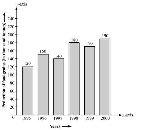
The following data gives the production of food grains (in thousand tones) for some years:
Solution:
| Years | 1995 | 1996 | 1997 | 1998 | 1999 | 2000 |
| Production | 120 | 150 | 140 | 180 | 170 | 190 |
Represent the above data with the help of a bar graph.
Let’s draw two mutually perpendicular lines OX and OY.
Along the horizontal line OX, let’s mark the years; and along the vertical line OY, let’s mark the production of food grains in tons.
Along the axis OX, let’s choose an equal width for each bar, keeping the gap between the bars the same.
We will now choose a suitable scale to determine the heights of the bar
Here, let’s consider 1 big division = 20 thousand tons.
Therefore, the heights of the various bars are as follows:
Height of the bar against the year 1995 = 120/20 = 6 units.
Height of the bar against the year 1996 = 150/20 = 7.5 units.
Height of the bar against the year 1997 = 140/20 = 7 units.
Height of the bar against the year 1998 = 180/20 = 9 units.
Height of the bar against the year 1999 = 170/20 = 8.5 units.
Height of the bar against the year 2000 = 190/20 = 9.5 units.
Based on the above calculations, the bar graph is as follows:
Question: 12
The following data gives the amount of mature (in thousand tones) manufactured by a company during some years:
| Years | 1992 | 1993 | 1994 | 1995 | 1996 | 1997 |
| Manure | 15 | 35 | 45 | 30 | 40 | 20 |
(i) Represent the above data with the help of a bar graph.
(ii) Indicate will the help of the bar graph the year in which the amount of manure manufactured by the company was maximum.
(iii) Choose the correct alternative.
The consecutive years during which there was a maximum decrease in manure production are:
(a) 1994 and 1995 (b) 1992 and 1993
(c) 1996 and 1997 (d) 1995 and 1996
Solution:
Let’s draw two mutually perpendicular lines OX and OY.
Along the horizontal line OX, let’s mark the years; and along the vertical line OY, let’s mark the amount of manure in tons.
Along the axis OX, let’s choose an equal width of each bar, keeping the gap between the bars the same.
We will now choose a suitable scale to determine the heights of the bars.
Here, let’s consider 1 big division = 5 thousand tons of manure
Therefore, the heights of the various bars are as follows:
Height of the bar against the year 1992 = 15/5 = 3 units.
Height of the bar against the year 1993 = 35/5 = 7 units.
Height of the bar against the year 1994 = 45/5 = 9 units.
Height of the bar against the year 1995 = 30/5 = 6 units.
Height of the bar against the year 1996 = 40/5 = 8 units.
Height of the bar against the year 1997 = 20/5 = 4 units.
Based on the above calculation, the bar graph is as follows:

(ii) The amount of manure manufactured in the year 1994 was the maximum.
(iii) (c) 1996 and 1997
Explanation: The production decreased by 15 thousand tons from the year 1994 to 1995, and from 1996 and 1997 the production of manure decreased by 20 thousand tons.
View courses by askIITians


Design classes One-on-One in your own way with Top IITians/Medical Professionals
Click Here Know More

Complete Self Study Package designed by Industry Leading Experts
Click Here Know More

Live 1-1 coding classes to unleash the Creator in your Child
Click Here Know More