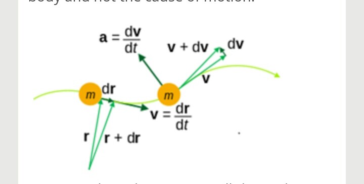
Absolutely, I’d be happy to help explain the figure you’re referring to! While I don’t have the visual in front of me, I can guide you through how to analyze and interpret figures in general. Let's break down the process step by step, using a hypothetical example to illustrate key points.
Understanding the Components of a Figure
Figures often contain several elements that convey information visually. These can include graphs, charts, diagrams, or images. Here’s how to approach understanding them:
- Title: This usually summarizes what the figure is about. It gives you a quick idea of the main topic.
- Axes (for graphs): If it’s a graph, check the x-axis and y-axis. They represent different variables. For example, in a graph showing temperature over time, the x-axis might represent time (days, months) and the y-axis might represent temperature (degrees Celsius).
- Legend: This explains any symbols, colors, or patterns used in the figure. It’s essential for understanding what each part of the figure represents.
- Data Points: Look at the individual points or bars. Each point represents a specific piece of data. For instance, in a bar graph showing sales over several months, each bar represents sales for a particular month.
- Trends: Observe any patterns or trends. Are the data points increasing, decreasing, or remaining constant? This can provide insights into the relationship between the variables.
Example Analysis
Let’s say you have a line graph showing the growth of a plant over a month. Here’s how you might analyze it:
- Title: "Growth of a Sunflower Plant Over 30 Days" – This tells you exactly what to expect from the graph.
- X-Axis: Days (1 to 30) – This shows the time period over which the growth is measured.
- Y-Axis: Height in centimeters – This indicates how tall the plant is at each point in time.
- Data Points: Each point on the line represents the height of the plant on a specific day. For example, on day 15, the plant might be 15 cm tall.
- Trend: If the line slopes upward, it indicates that the plant is growing taller over time, which suggests healthy growth conditions.
Connecting the Dots
Once you’ve identified these components, try to connect them to the broader context of what you’re studying. Ask yourself questions like:
- What does this figure tell me about the subject?
- How does it relate to the concepts I’ve learned?
- Are there any surprising findings or patterns?
By following this structured approach, you can gain a deeper understanding of any figure you encounter. If you have specific details about the figure you’re looking at, feel free to share, and I can provide a more tailored explanation!